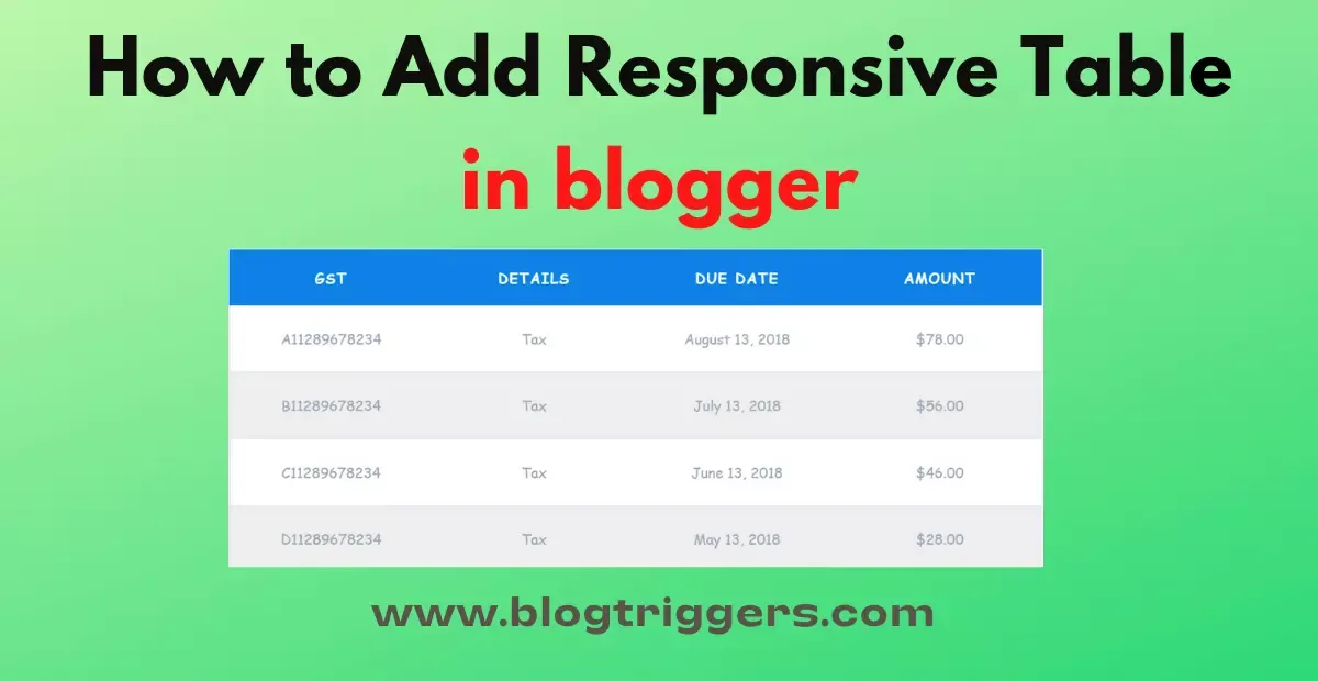
Tables on a website are meant to make data easy to read. To accomplish this, the table has rows and columns. A row comprises several cells, and a cell is the intersection of a row and column.
Hi friends, I will show you how to make a responsive table in a blogger in this tutorial. Responsive tables are essential while displaying table data on different screens such as PC and mobile. With the use of media queries, we can change the style of the table as per the device viewing it.
Do you want to generate your Meta tag? Then these posts will help you to Generate meta tags quickly. Learn how to Generate Blogger Meta Tag Generator?
Now First, We Will Discuss What a responsive table is?
What is a Responsive Table?
A Responsive Table is an HTML table that can be flexible and adaptive in any browser window size. A responsive table not only displays correctly on any device like desktop, laptop, tablet, and mobile; it allows a user to dynamically sort, filter, and search its rows directly using a mouse or finger gestures (on touch devices).
3 Steps to Add Responsive Table in Blogger
Step1) Go to The Blogger Dashboard & create a new post in it.
Step2) After Creating a New Posts, you have to copy & Paste this HTML & CSS Code.
Download Code
Step3) After Inserting this code click on Publish or Update Posts.
Congratulation, you have successfully added the Responsive table in blogger.
What are the Benefits of Responsive table in blogger?
There are Plenty of Benefits are there, but we will tell you only the Best one
- The responsive table in blogger practically keeps your visitor engaged in your site since they don't need to do anything except resizing their browser window.
- Your customers will have a more interactive experience and will return to your blog more often.
- Save time and energy, no waiting for things to load on both desktop and mobile view
- Responsive tables may contain added features like sorting columns or even a summary feature that allows users to get a big-picture overview of the data.
Why do we have to Use a Responsive table in Blogger?
Non-responsive tables show better on a desktop or laptop screen than on a mobile phone. But in this case, there is a simple yet highly complex solution to cope with responsive tables. That is using a responsive table on Blogger, and it will not ruin your website design.
Conclusion
Using a responsive table makes it easier for your blog readers to read the information you're presenting.
Please share this post with your friends by clicking on the share links below if you find this post helpful. If we can help answer any questions, please post them in the comment section, and we will try to respond as quickly as possible.
Thank you For Reading This Post


